Saturday 23 August 2014

Week 14 - Amazing Hand-Stitched Embroider


This is so beautiful and peaceful. When going closer, you will  see the sewing technique using on it. Another name for it is hand-stitched embroidery. This is so creative that it can be stitch on the painting and make it so interesting. This is a new drawing or creative design technique.


From this artwork, you can clearly see that the stitch on the painting and create the depth and space between the stitched embroidery. It was become more interesting and make me learn a new knowledge. 

Those artworks were done by Hinke Schreuders. She doing so that texture can be touched on the painting, Furthermore, she also apply repetition on the paintings. This is so fantastic and amazing that inspired me that no only the water-based media can be used on the painting but other media do so.

Week 13 - New Floppy Disc Portraits


Nowadays, I believe that no one is using the floppy disc to store their files and document in it. After invention of CD, DVD, Thumb drive, and hard disk, floppy discs are no using anymore as it's storage is small than other. I never know that floppy disc can be using as a media for design, after I saw it. This is amazing and interesting! 


Those artwork are designed by Nick Gentry, British artist. Most of  artworks are portraits and using floppy disc as media. He reuse the things that is no longer useful to create a pleasing of artwork. He inspired me that I have to be a reuse the things that unwanted and need to be a economy person. This is the path that be saveing the earth and reuse it to be a great artwork.


Saturday 16 August 2014

Week 12- Nike


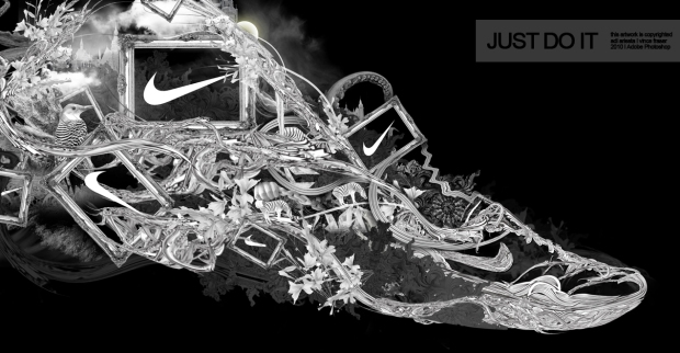
First, Nike is a globalization brand that have a strong, powerful and loyalty since 1988. They use emotional advertising to persuade customer that the great quality of Nike. The logo of Nike means nice choice which a correct tick.


This the graphic designer do. This designed by Vince Fraser, 2010. He use different element and arranging them to show the interesting composition. He use black and white color on its to show the powerful, formality. Color is simple used as Nike has a powerful brand. Although it simple on color, but a strong influence to customer. When i see it, it make me liking to buy shoes branded by Nike. As the slogan used "Just Do It" make me feel confidence. This has inspired me in logo design that a great design can be so influence. It also inspired me that the creativity of composition.

#Nike typography ad, Great example of typography used in advert posters.

Nike has a strong influence in anyways and anyplace. Build up a strong logo can have a longer loyalty of customers to support it. Nike is a good example and a most successful in logo. This one creative advertising is used typography to shoe the shape of shoes and logo which is Nike. Typography again show the creative and make it interesting.This should be graphic designer do, and i have to learn from it.

Saturday 9 August 2014

Week 11 - Poster, Music is ...


There have been a long time that i unable to see cassette tape again since i was small. At that time, it was a type of storage to store the music. I believe that no one still listen this cassette tape anymore. It a classical.

This poster titled as "Music is ..." was created by phunk studio at year 2003. It speaks of a frustration at that current music industry. Cassette tape was been unraveled to form the typography. when a cassette tape unraveled, it mean shot, done, and dead, you cannot longer listen to it again. This is effective, and you can sense their anger and frustration without the direct spelling of the four letter word that ends in k. As designer, they can be express their feelings and emotions in their artworks to interpret the messages or events. 

Saturday 2 August 2014

Week 10 - Pencil Vs Camera


Creative Artwork 17 Pencil Vs Camera – Creative Artwork
Creative Artwork 20 Pencil Vs Camera – Creative Artwork
Creative Artwork 32 Pencil Vs Camera – Creative Artwork

Those artworks are done by Ben Heine. He likes to draw when he was in young age. Later on, he started interesting on photography. but he did not make any specific on both. He create those creative artworks by using pencil drawing and taking photo by camera.

For me, those artworks inspired me as using drawing technique and photography. By combination of both drawing technique and photography create a new visual and creativity. This can be apply on graphic design or advertising to get a attention from the customers. I wish that able to using this technique in my designer journal.


source: http://photovide.com/pencil-camera-creative-artwork/

Saturday 26 July 2014

Week 9 - WWF (Panda)

As in brief, WWF originally stood for "World Wildlife Fund" and changed its name to "World Wide Fund For Nature". Let watch this panda which WWF used as its logo. In this design, he used the closure on this panda. Although the panda above is not complete, enough is present for the eye to complete the shape.

 WWF: Panda Antelopes 
WWF: Panda Forest
WWF: Panda Water

Those are the WWF Outdoor Advertising which designed by Pan Jianfeng in year 2006, China. The message inside the artworks are we not only protect the giant panda which mean protect the others. the art works has bring out those meanings by using positive space and negative space. In WWF: Panda Antelopes, we see the positive space is the antelopes which negative space is the panda. As other so so, WWF: Panda Forest seems positive space as forest while negative space as panda. I was be inspired that using the advertising bring out the meanings on it  and apply  it by use its logo or main object. It was creative although it apply positive space and negative space and seems simple but after interpret it, i found that how the designers creative are they. I hope i able be using it as my idea generation and improve it in my design journal. 

Saturday 19 July 2014

Week 8 - Ninja Assassin


Ahhhhh... My head...
At first impression, I was shocked that how can he be so cruel to the bird and cut off its heads.
 It is look so reality, in fact it is. 


Haha, I was been cheated by him. He is using two bird: one show the head, one show the body. It make the viewer seems as real and cruel, in fact it is the trick the artist used. In this design, he drawing the ninja first and then cut the hole for the birds. He apply red acrylic to represent the blood which can look as real blood. Lastly, put the birds accordingly into the hole then it look like ninja had cut off the head.

Well, let me introduce this artist who named Ali Abd Alrazzaq lives in Iraq. He has a lot of nice artworks but i just show one of his artworks. I found this creative artworks which be shared in the Facebook. i was inspired as this artworks been creative and simple design. It does not meaning the nice artwork need spend a lot of time and money. Creative also can be a nice design.

Reference : https://www.facebook.com/photo.php?fbid=295909330586860&set=pcb.10152573126597048&type=3&src=https%3A%2F%2Ffbcdn-sphotos-a-a.akamaihd.net%2Fhphotos-ak-xpa1%2Ft1.0-9%2F10476023_295909330586860_1685534347958883296_n.jpg&size=960%2C687

Saturday 12 July 2014

Week 7 - Apple


Apple just a fruit, as say that a day an apple keep doctor away. Do you know that apple can be a creative thing or good design?


As you see that it is so creative and amazing apple. I never think that a apple can be a good design. The author using the apple slide to present the inner of the apple. It was so amazing.


By the way, this apple is too creative. This apple look like a real living thing. It has face and emotion, it also hold a knife on its mouth. It just an good design and very interesting.  


This apple is different from another, it has a rose flower texture on it. I am impressing this author, he has a good carve technique and carve a rose texture onto the apple. It is a good artwork and design. It is fascinating.

I am inspired by those apple that can be so creative and knowing that apple not only been eaten, but create a art or design by using apple. In future, i hope that i can using this technique in my design journey.


Saturday 5 July 2014

Week 6 - Laforet Private Party by Mizuno Manabu


Laforet Private Party, poster, Laforet

This is a Laforet Private Party's poster, designed by Mizuno Manabu in year 2008 at Japan. He designed this poster enclosed in the invitation card for a private party held at a popular mall, Laforet, in Tokyo.

He apply pointillism on his poster to make interesting to attract people to get attraction. He apply geometric shapes, circle, and colour to make repetition on his design. Different size and colour of the circles was formed value and depth, this had formed a skull from his poster when we look on it. 

This designed poster has inspired me that using pointillism with colour and size to make value and depth to create a form of image. No only just drawing the image, but apply others technique to create a creative and attractive design. 

Saturday 28 June 2014

Week 5 - Pig Mug


Pig Mug

Pig Mug

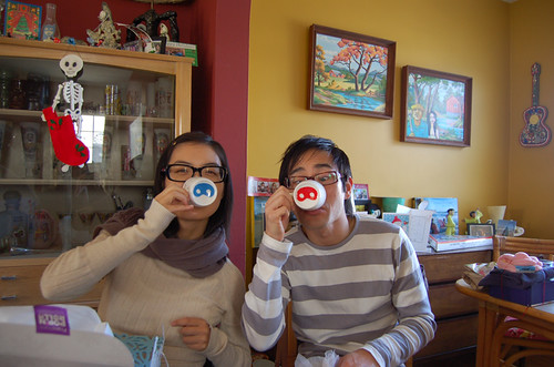
I found that this mug on the book and discovered that it is quite interesting and creative. It's design was simple and very easy to remember. He apply the pig's nose on the bottom of the cup and nothing design on the surface of the the cup. While using the this pig mug to drink, it can make the user look funny. Other peoples see it, it can release the stress and make a jokes from the office hours. it seen like no much visual on its, but design is apply on anything and make people's life happier. 

Saturday 21 June 2014

Week 4 - Bruce Lee by Marcus Lim

Picture
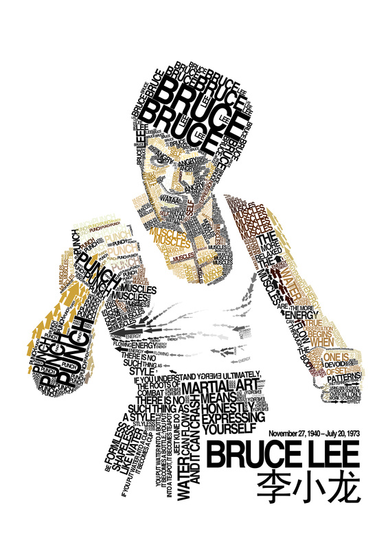
Bruce Lee, personal work by Marcus Lim

This artwork is done by the Marcus Lim, who is living in Singapore at Year 2008. This one artwork is attracting me and i discover that all he use is typography and arrow. This artwork bring out a feeling that reality, emotion and movement. No line is used in this artworks.

He is using the typography to represent the shape of Bruce Lee. He also using the arrow to create movement that attracting me to look clearly on this artworks. he also using Angry word to represent the emotion of it. he also used the arrow to represent the cloth's texture.

This artwork inspired me that not only line can been use to form, but others also. Creative of this artworks is amazing and been inspired me.

Sunday 15 June 2014

Week 3 - the OLDE STATION kopitiam

Firstly, I was discovering a Kopitiam at Jaya One, Section 13. I was attracted by its logo, it was using one yellow color and narrow spacing on the logo. It using capital letter on "OLDE STATION" while using small letter on "the" and "kopitiam". A pictogram of a cup was apply on the middle left of the logo.

Logo of the Kopitiam

Inside the Kopitiam, there is a painting designed with black color and white color. This called as negative color which is no applied balck color straight forward on the painting. It's background use the the olde times' things and games . It use radial balance on the painting. The typography used was playful which is "Olde Comes Play at the park". 


Painting inside the Kopitiam

Besides that, there had two different pattern of the wall design. It uses red block pattern and brown wooden. It make a asymmetrical balance on the wall and very interesting. It also use warm colors on the whole kopitiam. It have a feeling of older, warm, and comfortable. By those, I inspired by the design of logo, painting, wall and color that applied.


Wall of inside of the Kopitiam

Sunday 8 June 2014

Week 2

Well. Last Friday, I am been invited by my friends to reunion together to have a little time at Rekindle, SS2. It was been long time ago after having the Final Exams, UTAR.


REKINDLE SS2

The design of logo is simple and easy to remember. The colour of the logo is applied warm colour which can customer feel warm and friendly to increase the customer come back again. Inside the shop, they use warm colour on their wooden table and chair. From this, I learn that colour make the different of feeling.

INSIDE OF REKINDLE SS2 

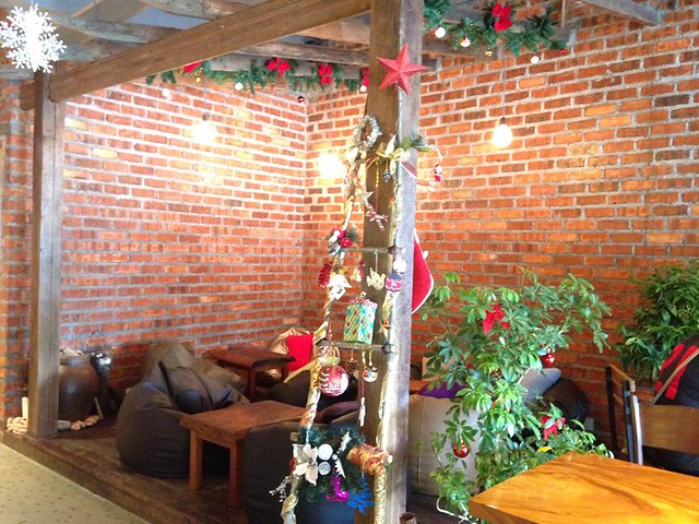
Furthermore, they also use different materials design their walls. this make a creative. The design is use the pattern of red block wall and reuse the materials which is very interesting to me. The all design of the Rekindle had inspired me and make a comfortable, relax and clam feeling.

Sunday 1 June 2014

This is my first time to use the blog, but i really don't like to write something in the Internet.Since this is a part of the homework, then i will try my best to write something.

First, I am Lam Poh Seng. I am 21 years old and my hometown is Sarikei which is located at Sarawak. It is just a little place. Now, I live in PJ and study Graphic Design in UTAR. I think thats all about my part.

Yesterday, i was shopping with my friends at the MidValley. i did not saw an accident happen, but i look down from the Fourth Floor, I saw a girl with the blood on the floor at Ground Floor. I was shocked and feel sad and scare about it. I heard that the girls is fell from 4th Floor which was happen on same floor with me. it was a sad case. After that, i was fought that accident happen  without giving a warning, it just happen too fast until we cannot react it. One person' life is unpredictable, it can be longer or shorter. So, be graceful at all the time and always take care about your beloved, be more alert and careful.