First, Nike is a globalization brand that have a strong, powerful and loyalty since 1988. They use emotional advertising to persuade customer that the great quality of Nike. The logo of Nike means nice choice which a correct tick.
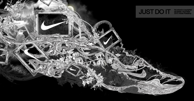
This the graphic designer do. This designed by Vince Fraser, 2010. He use different element and arranging them to show the interesting composition. He use black and white color on its to show the powerful, formality. Color is simple used as Nike has a powerful brand. Although it simple on color, but a strong influence to customer. When i see it, it make me liking to buy shoes branded by Nike. As the slogan used "Just Do It" make me feel confidence. This has inspired me in logo design that a great design can be so influence. It also inspired me that the creativity of composition.

Nike has a strong influence in anyways and anyplace. Build up a strong logo can have a longer loyalty of customers to support it. Nike is a good example and a most successful in logo. This one creative advertising is used typography to shoe the shape of shoes and logo which is Nike. Typography again show the creative and make it interesting.This should be graphic designer do, and i have to learn from it.
No comments:
Post a Comment